With the popularity of humble subway tile and simple stone slabs, it’s easy to forget that there are so many other ways tile can bring incredible life and drama to your home.
If you’re looking for a next-level tile design with a little splash of personality, consider some of these ideas for patterns, styles, and layouts for a jaw-dropping effect.
1. Go with classic black and white.
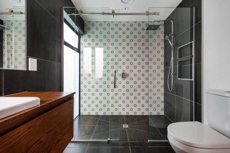
We often think of exotic tiles as being wildly colorful, but when I’ve visited Europe and taken in the lovely tile designs in the beautiful homes and resorts, I’ve been struck by how many different ways classic black and white can be used.
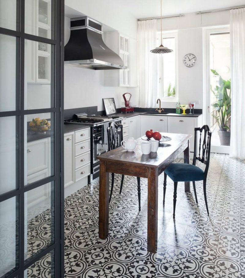
A monochromatic color palette in a traditional Fleurette design gives a room a definite sense of sophistication and stands the test of time.
2. Tile the bath surround.
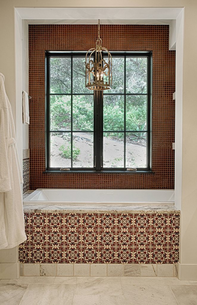
Tiling the front of a drop-in bathtub (rather than using a plain white ceramic or plastic tub kit) can bring a luxurious look without the need to splurge on a lot of tiles.
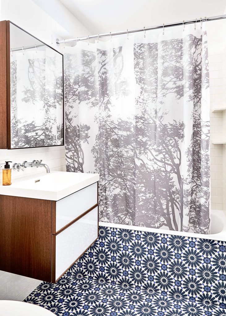
For a modern effect, bring the same tile from the floor up the face of the bathtub. People tend to notice vertical surfaces first, so this approach gives your dramatic floor tile a little extra attention.
Choosing a pattern in classic white and navy blue keeps the treatment looking clean and current for years to come.
3. Tile the island.
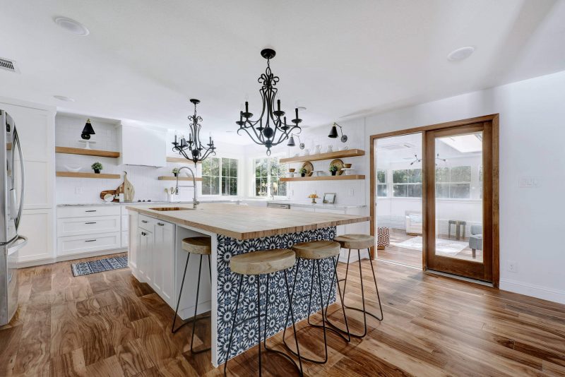
By coincidence, this home uses the same tile as the previous example, but in a different location: the kitchen island.
Often we think of the island as being just more cabinetry, but it can actually receive more wear and tear than standard wall cabinets due to bumping stools and kicking feet.
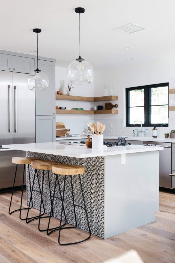
Tiling the seating area gives a little more durability to the surface, while also making a stylish statement that gives a beautiful burst of color and pattern.
The tile here doesn’t need to be the same as the backsplash tile, especially if the backsplash is a more plain finish, like a crisp white subway pattern. Besides, letting the island front be its own feature is more unexpected and fun.
4. Try a rug-like inset or borders.
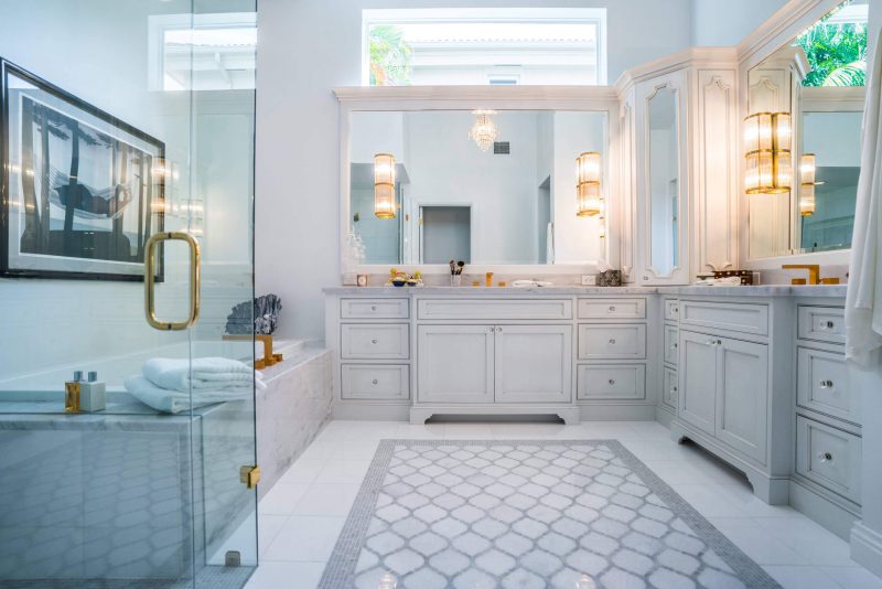
A rug in the bathroom can be beautiful, but for some, it feels too impractical. A rug-like tile composition gives you the look of an area rug in the same hard-wearing finish as a standard floor tile.
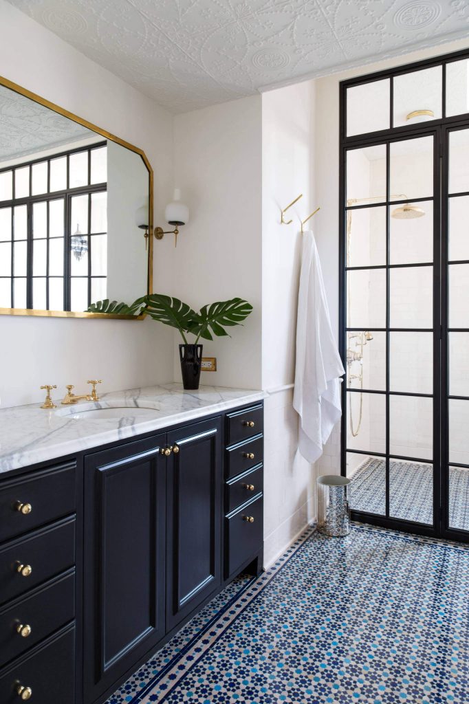
You can use an area of contrast tile inset amid a more plain tile like the previous project, or take inspiration from this photo and use a tile border to give subtle structure to an all-over pattern.
Combine this look with in-floor heating and you’ll feel like you’re standing on a cozy rug.
5. Add wall stripes.
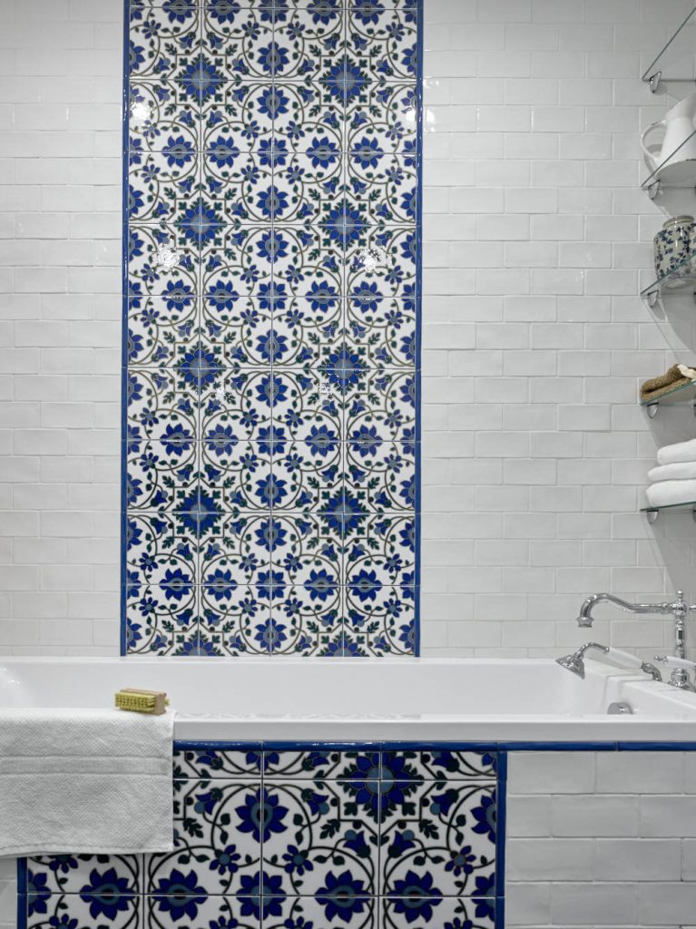
A stripe of intricate statement tiles, often just two to three tiles wide, can bring a lot of drama to space without overwhelming it with a busy pattern.
This is a great way to introduce a little European flair into your bathroom through an exotic or antique tile pattern without it looking like a “theme room.”
6. Play with tile trim.
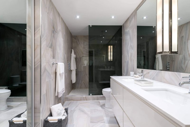
Design is all about the details, and when tile reaches a corner or stops partway along a wall, how well the edge of the tile is finished can make a noticeable difference to the look. One way to beautifully cap off tile, and add a little hint of sparkle, is with a sleek metal tile trim
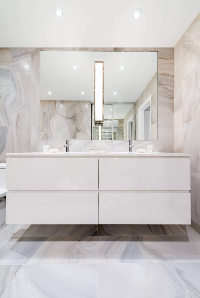
I often design bathrooms with mirrors inset into the tile for a flush, sleek composition, and a gleaming tile trim beautifully transitions from the tile to the glass pane within while also giving the mirror a subtle frame for an extra sense of polish.
You can find tile trims online or in hardware stores, but you can also talk to a tile or mirror installer to find the best option for your installation.
7. Go for rough edges.
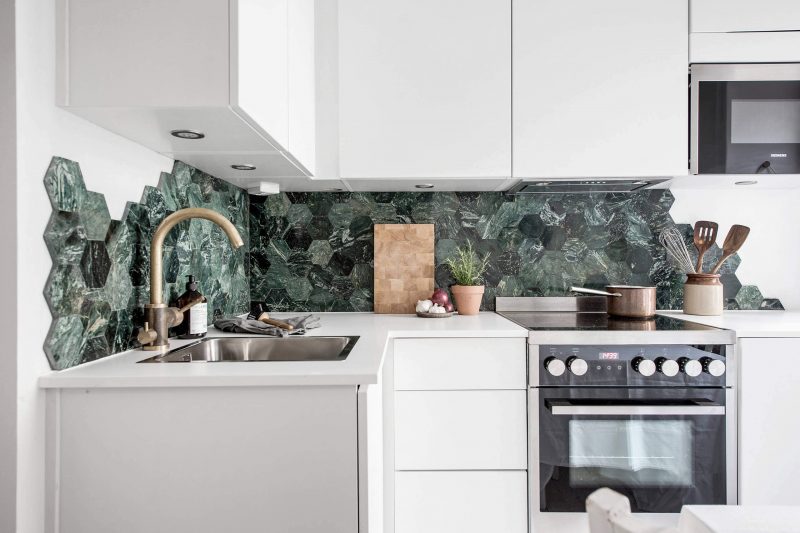
Hexagons are a popular tile shape, but the diagonal edges mean they are often a bit trickier to install than a plain rectangle, with lots of pieces needing to be cut to make the sides end crisply in a straight line or at a corner.
Or you can consider skipping all of those issues and let your tiles end where they may, creating a free-flowing design that refuses to conform to typical in-the-box thinking.
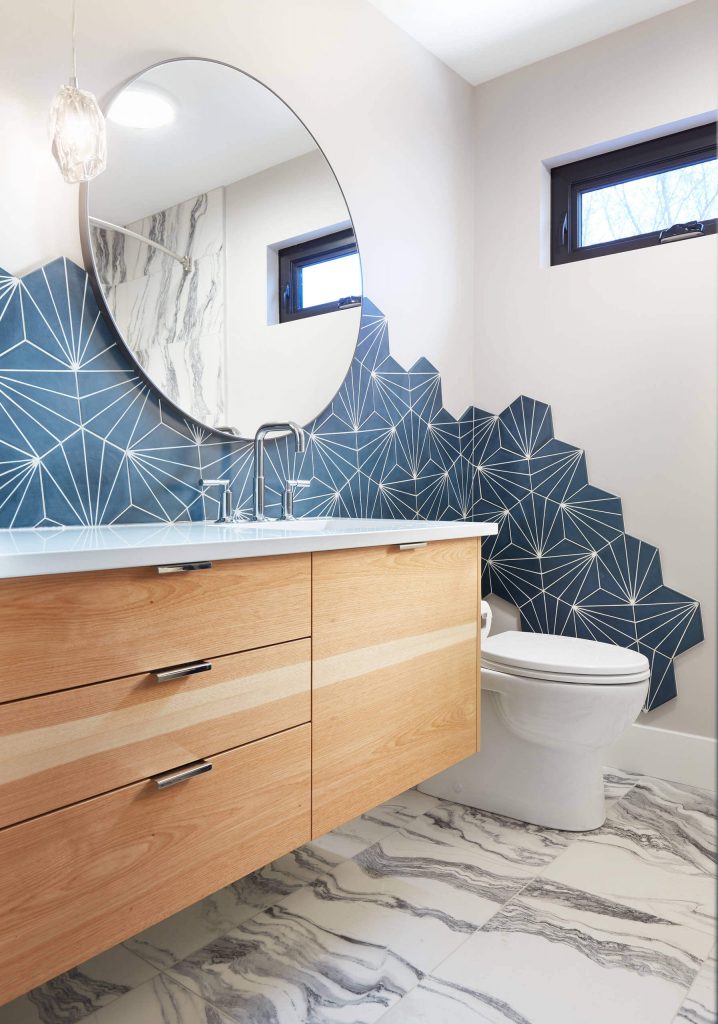
This rough-edged approach is another smart way to introduce a tile in a bold color or busy pattern without having it overwhelm a room.
You can add a small area of tiles was needed to prevent splashes and spills while adding just the right amount of style.
8. Open up to ombre.
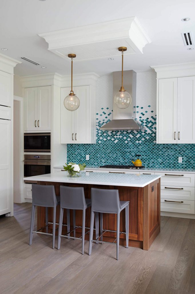
Sometimes a solid color can feel too overwhelming, especially a vivid hue like aqua blue. That’s where tile comes in, giving multifocality that is hard to achieve on a wall with paint and a brush.
For a fun effect, try taking two different colors of the same tile and fading from one hue to the next to get an ombre fade, using the boldest hue toward the bottom and a paler one (or a simple white) more toward the top to keep that color in check.
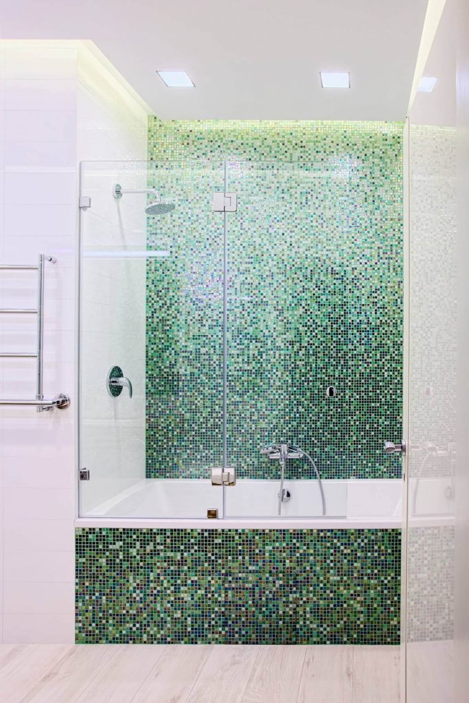
If you or your installer have a little patience, you can also buy a multi-tonal mosaic tileset and separate out the individual tiles (or small groups) from light to dark, and then apply them in an ombre that fades through multiple hues, as evenly or loosely as you prefer to achieve many different effects.
This shower accent wall likely took some time to install, but the result is definitely invigorating.
9. Toy with textured tiles.
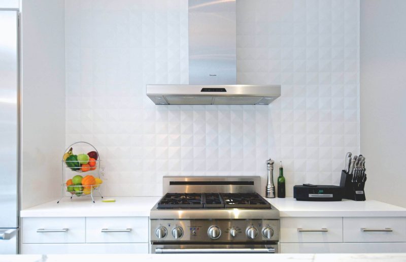
Tile doesn’t have to be brightly colored to have a dramatic impact. If you like the idea of an interesting tile but also want to keep your kitchen or bathroom bright white and breezy, consider an embossed or shaped tile with a textural face. These can add a sense of richness to your surfaces without breaking up a minimalist color palette.
Textured tiles can be used all over, but often they look best when used as an accent, especially as a backsplash in a kitchen or behind a vanity.
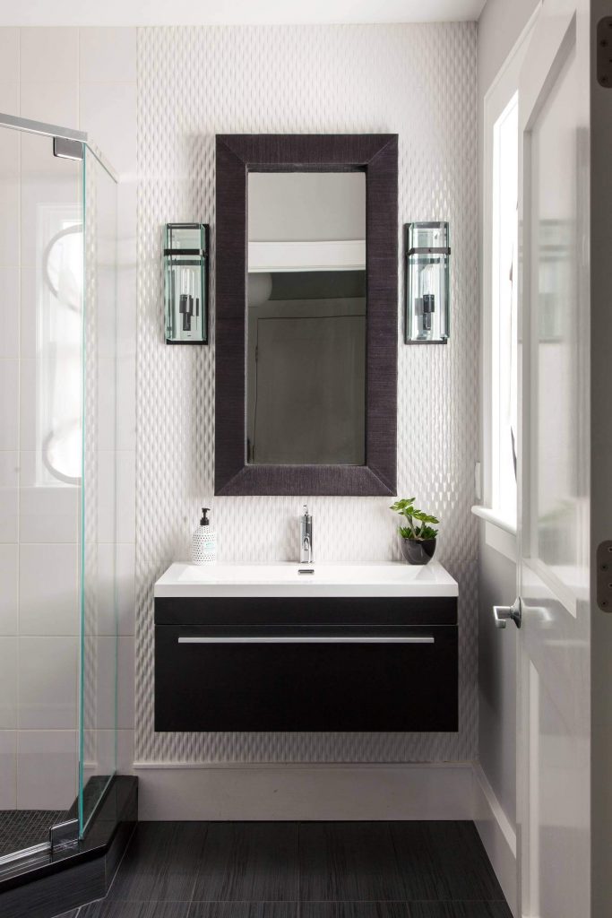
Notice how this bathroom uses a vertical band of subtly textural tiles just in the sink area, with a more plain ceramic tile on the adjacent walls.
The overall effect is subdued but gives the room a sense of designer polish, and it plays beautifully against the dramatic black accents. Again, the color palette is simple, but the room feels richly detailed, and that brings a sense of luxury.
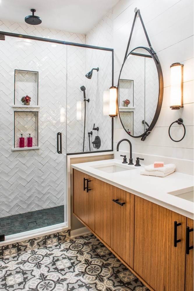
For traditional or transitional spaces, try an unrectified ceramic tile, which means the edges are a bit uneven in a beautifully imperfect way.
This gives a sense of texture because the adjacent tiles don’t quite line up, creating a subtle rippling effect that feels touchable and stylish.
10. Celebrate cement and concrete.
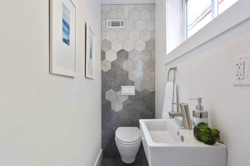
A poured concrete floor can take a major overhaul to achieve, but a touch of cool concrete can be added to any room with a few concrete or concrete-look tiles.
This textural material is a great addition to contemporary spaces, and especially in bathrooms, as it has a clean look but with a texture that contrasts and complements slick porcelain and brushed metals, bringing a new dimension to your palette.
11. Capture colorful floors.
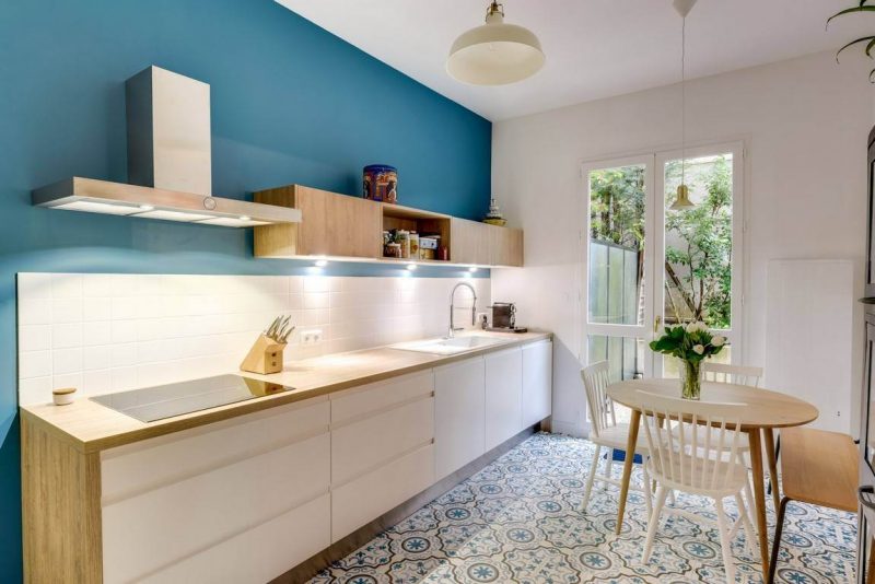
Who says your floors have to stick to a safe, neutral palette of wood or stony grays? A floor tile with a splash of color can be surprisingly easy to coordinate with.
Work with accent hues elsewhere in the room to create a space that feels lively and filled with personality but still casual and livable.
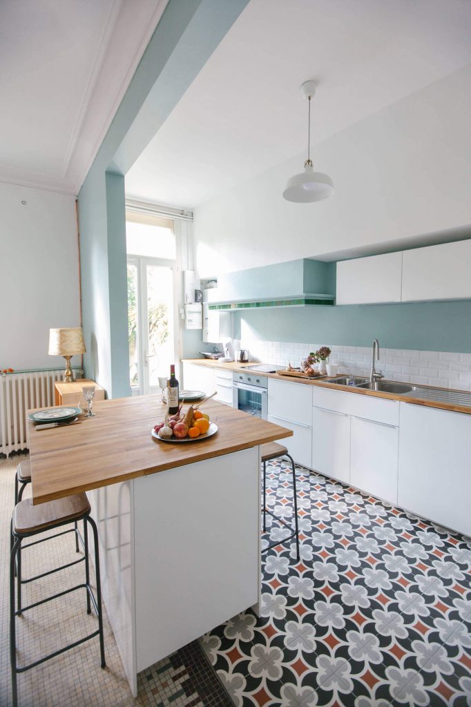
Even seemingly daring hues like red can work well as a small accent within a tile pattern. Think of how a traditional rug feels neutral even with its many maroon hues.
12. Look at large-format geometrics.
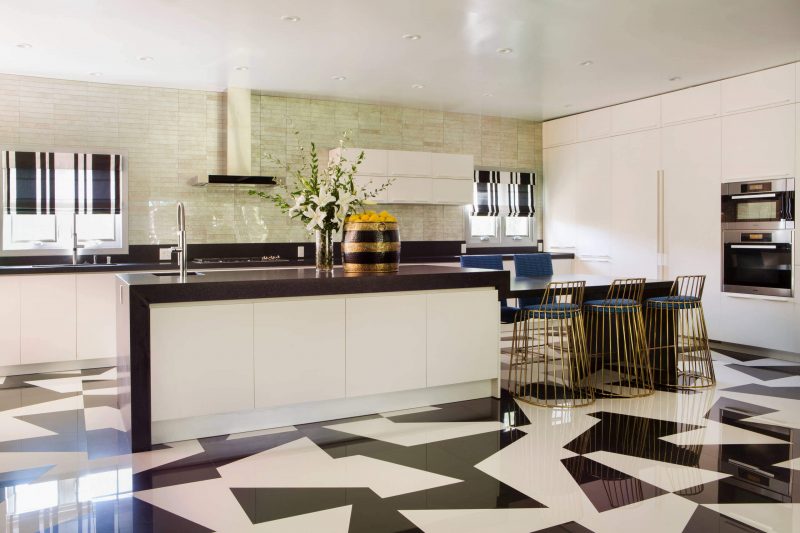
Think this tile pattern looks incredibly intricate? In fact, the pattern is simpler than you might guess.
If you look closely, you can see that this design is made from repeating one large square tile that is diagonally split into a white half and black half — and a mirror image of the same tile — rotated randomly about the floor. Together they form energetic shapes that seem to have no beginning or end.
To create a look like this, shop for large-format tiles with a simple design, and make sure to look at several tiles together to see how the pattern looks repeated. Sometimes the most simple tile design can surprise you.
13. Make a mini mural.
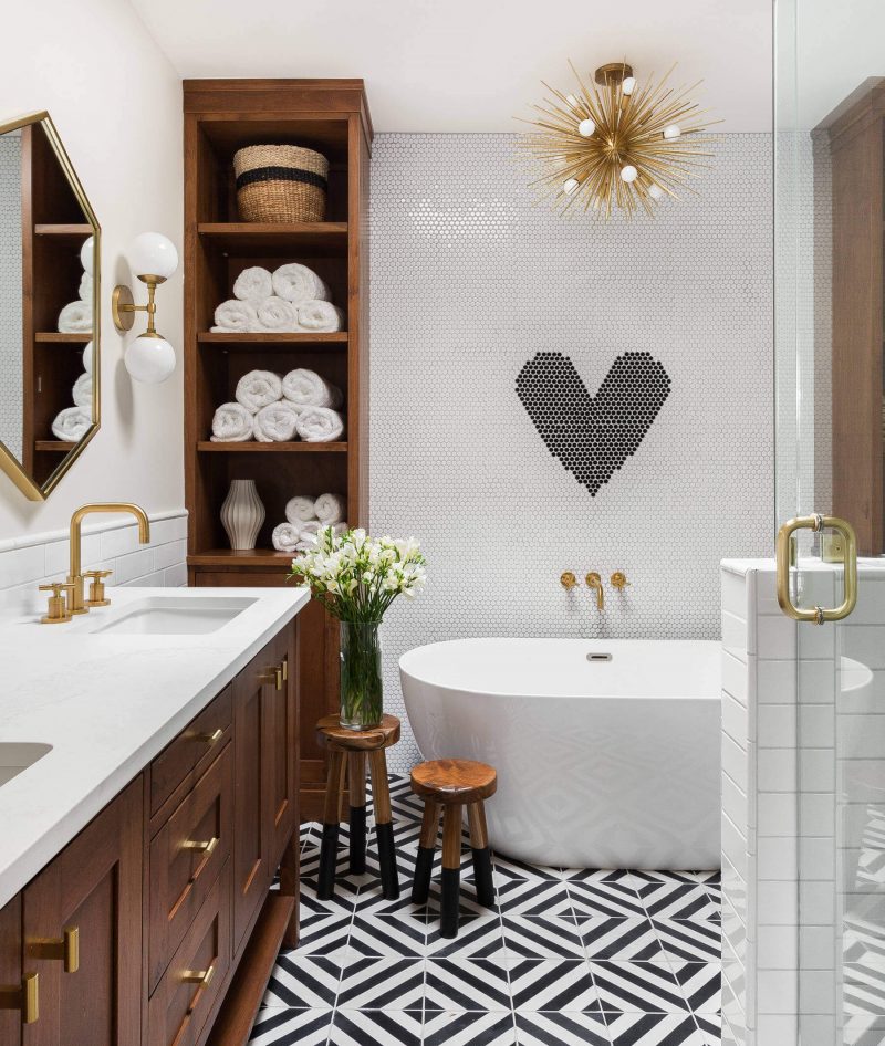
A full wall-to-wall tile mural can be a bit overwhelming. Sometimes all you need is a basic shape in a small area to make a big impact.
A mini mural like this heart shape uses just a few contrasting tiles to give the room plenty of personalities.
Source: houzz.com/magazine


You must be logged in to post a comment.