The kitchen is the heart of the house, where we go for nourishment and to gather with friends and family. Kitchens should be hardworking, but they should also be enjoyable spaces to spend time in.
The following of the most popular kitchen photos since Jan. 1 balance these two requirements perfectly.
Oversize kitchen islands and lots of built-in storage mix with hand-painted tile and carefully crafted woodwork to create functional, memorable designs.
1. A Place to Work From Home
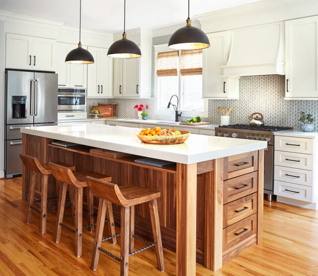
A walnut-base island is the hub of this kitchen designed by Melinda Woodruff of M Woodruff Design in Annapolis, Maryland. Serving as the home workspace for one of the owners, the island features bar stool seating, drawers for papers, and even a shelf under the counter (with outlets at the back) for the homeowner to store a laptop and other work tools.
Three-inch-thick quartz counters — Listra by Pental — top the island, adding contrast to the rich wood while coordinating with the white perimeter counters and cabinets.
2. Soft Colors and Lots of Storage

Stephanie Flemming of Flemming Interiors removed a peninsula that used to separate the cooking area from the dining area in this Chicago kitchen, creating a more open kitchen space. The move also allowed her to add 30 continuous feet of cabinets to the back wall, giving the homeowners the extra storage they wanted.
“Because there is 30 feet of cabinetry on one wall alone, we wanted cabinetry that was still light and bright but felt warm,” says Flemming, who used Houzz to gather inspiration photos for the project. “We achieved this by incorporating wood tones with the gray upper cabinets and using a light-colored countertop and backsplash.” Mixing up the hardware styles between doors and drawers also helps to break up the expanse of cabinets.
3. Light and Bright With Warm Wood
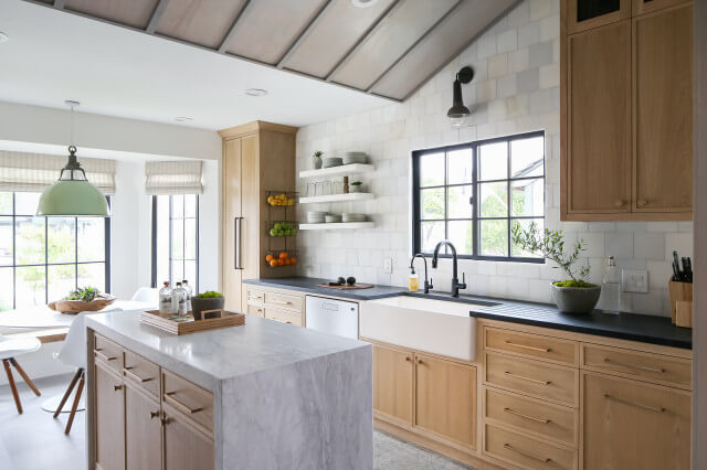
For his own kitchen in Laguna Niguel, California, designer Nate Fischer created a space that balances modern elements with a classic design. “Something bright and fresh but also warm and cozy,” he says.
Light-gray-washed red oak cabinets are a nice alternative to the standard white, and they were less expensive than white oak. “I didn’t use a stain but a slight gray wash over the wood to keep it from reading too orange,” Fischer says. “Using wood instead of white on the cabinets let me bring in white tones with other materials in the room without it feeling too white.”
Dark soapstone counters line the kitchen’s perimeter, with an integrated drainboard next to the sink. The island is topped with marble with a waterfall edge.
4. Elegant Moody Blue
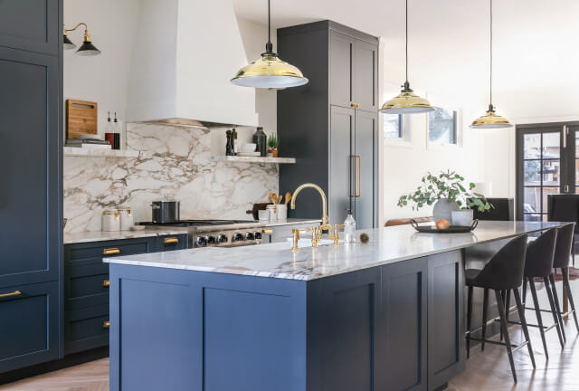
For this kitchen renovation in Calgary, Alberta, the homeowners requested a space that felt moody but was also colorful, functional, and beautiful. “We were inspired by the trendy and elegant streets of SoHo, New York,” designer Lindsay Peters of Elle Peters Design says.
The custom blue paint (75% Railings and 25% Hague Blue, both by Farrow & Ball) brings the color the owners wanted while keeping the look sophisticated. The one-of-a-kind marble slab adds even more interest. “We looked at a lot of slabs before finally pulling the trigger on this Paonazzo beauty,” Peters says. “I think the colorful veining provides just the right amount of drama we were going for.”
The lack of upper cabinets around the range and the integrated pantry and fridge in matching cabinets on either side of the range keep the space feeling light and elegant.
5. Hardworking Family-Friendly Farmhouse Style
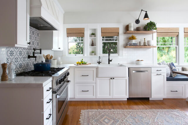
A couple with three children under the age of 5 worked with Hope Pinc Design to create a family-friendly kitchen with a modern farmhouse style for their 1925 Craftsman home in San Diego. The designer kept the home’s original windows and built-in shelving and added a white subway tile backsplash, farmhouse sink, and quartz counters that resemble marble to tie in with the age and style of the home.
Undercabinet storage works hard in this kitchen and includes a pullout trash and recycling area to the right of the dishwasher. The drawers to the left of the sink hold pots and pans. Floating oak shelves keep the space open and light and allow the homeowners to display decorative items and cookbooks.
6. Inspired by Hand-Painted Tile
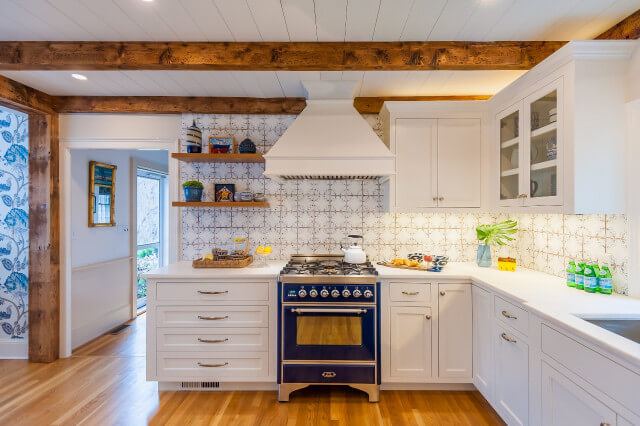
A few years ago, Houzz writer Becky Harris showed her parents a photo of hand-painted terra-cotta tile in a kitchen she was writing about, and that photo became the jumping-off point for her parents’ remodel. “Three decades of hard wear and tear had taken their toll,” Harris says of her parents’ 19th-century farmhouse outside Boston, “and by 2018 my parents needed to make some changes to help them age in place in their home.”
On Houzz, the couple found Robin Violandi and Caroline Warner of Violandi + Warner Interiors and worked with them to create a space they could enjoy for years to come, with aging-in-place features like deep drawers and drawer-style dishwasher and microwave.
The same tile Harris showed her parents were used for the backsplash. A new blue range matches the tile and pops against the rest of the white kitchen, including the White Rhino quartzite counters with a leathered finish.
7. Light and Bright With Room to Entertain
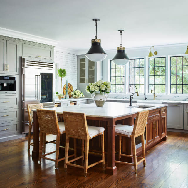
Interior designer Tyler Constanda of TC Designs and Christine Donner Kitchen Design collaborated on this renovation to give a family (which includes a wife who works in the restaurant industry) an update on the basic kitchen that came with their modern farmhouse in Connecticut.
New casement windows update and brighten the room, also creating a better view of the garden. To further lighten the space, the designers removed the upper cabinets around the sink.
A marble-topped walnut island gives the homeowners plenty of room to entertain. Along with an expanded pantry, it also helps make up for the storage lost by removing the upper cabinets. “You can compensate for removing the upper cabinets if you have the base cabinets do more, to hold stuff the wall cabinets would usually hold,” Donner says.
8. Modern and Industrial
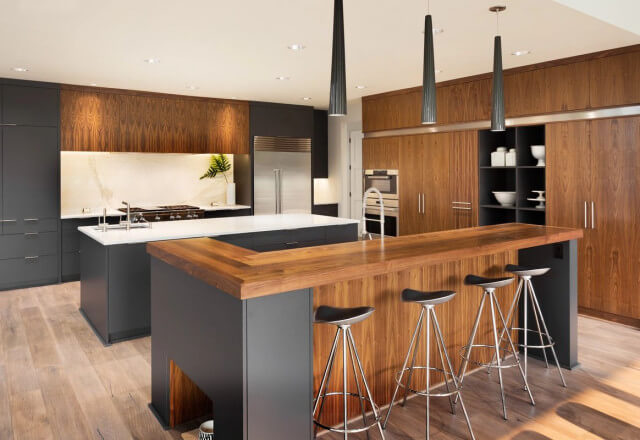
In San Luis Obispo, California, Marta Blachowicz of Martitect Design blended a couple’s style preferences — industrial for one, modern for the other. The pared-down materials palette, which includes a charcoal-colored paper and resin blend surface by Italian brand Fenix, streamlines the look and reinforces the two main styles.
The area of the island near the range serves as the main prep space and is topped with white marble. A high-gloss walnut countertop the other island, which is used more like a bar and entertaining area. (Note the cutout nook for dog bowls in the island in the foreground.)
9. Craftsman Details
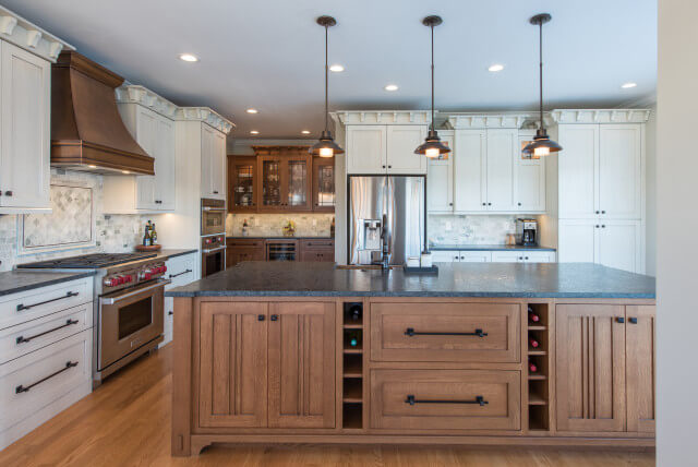
Todd Thomas and Katie Pipkin at Sticks 2 Stones Design helped the owners of this home in Knoxville, Tennessee, channel more of a Craftsman style in their kitchen, tying the previously outdated space in with the rest of the home. The design team expanded the kitchen by taking over part of the pantry and added a new quartersawn white oak island, detailing the base like a piece of Craftsman furniture. Dark granite countertops, built-in details and sturdy yet refined hardware all contribute to the look and functionality the homeowners were after.
10. Contemporary Farmhouse Style
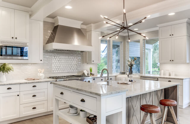
Candace White of The WhiteHouse Collection ticked all the boxes with this kitchen in a speculative home by Silver Oak Custom Homes in West Linn, Oregon. “It was important that the kitchen was the heart of the home, had great flow, entertained beautifully, and had a fresh look,” White says of the modern-farmhouse-inspired design.
A stained hickory island base subtly contrasts with the mostly white space. The island also features a raised baking station, an attractive and functional detail you’d expect in a farmhouse-inspired kitchen. The counters are quartz, and the chandelier adds a contemporary touch.
Source: houzz.com/magazine


You must be logged in to post a comment.